Key Takeaways
- Mass Merchant UX must help users understand how the site is laid out, how to choose between available products, and when to expect their products
- Failure to do any of these makes the site more difficult to use, and, worst case, causes site abandonment
- Improve your Mass Merchant site by helping your users with these 4 high-value best practices
Key Stats
- 69% of benchmarked sites don’t offer relevant autocomplete suggestions for closely misspelled search terms and queries
- 33% of sites don’t have a “View All” option in the main navigation at each level of the mobile product catalog
- 68% of sites don’t include product attributes consistently across their list items
- 37% of sites don’t estimate a “Delivery Date” and instead use “Shipping Speed” when predicting the arrival of a user’s package
At Baymard, we’ve continuously tested Mass Merchant ecommerce sites throughout our 25 rounds of large-scale qualitative usability testing with 4,400+ test participant/site sessions, and in our 54 rounds of manual ecommerce UX benchmarking of the world’s largest ecommerce sites.
We have found that Mass Merchant sites must satisfy rigorous user needs across a broad range of UX areas, because the diversity of their product offerings can be hard for users to access easily without a careful site design.
To name a few such areas, users must be able to intuitively understand the site’s organization, its search mechanisms, and how to compare its products’ attributes.
Fortunately, Baymard’s research findings reveal the best practices in these areas. This article will provide you with the best and worst practice examples from Mass Merchants as well as sites that sell products relevant to Mass Merchant sites.
In particular, this article describes 4 ways to improve Mass Merchant UX:
- Offer relevant autocomplete suggestions for misspelled queries
- Have a “View All” option in the main navigation at each level of the mobile product catalog
- Include product attributes consistently across list items
- Use “delivery date” rather than “shipping speed” when predicting package arrival
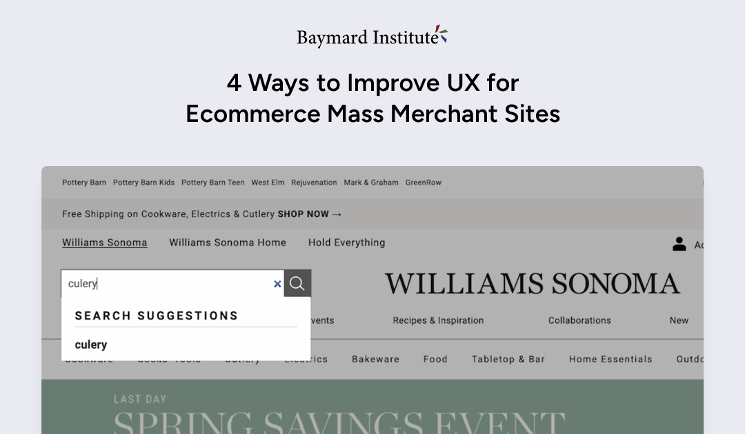
1) Offer Relevant Autocomplete Suggestions for Closely Misspelled Search Terms and Queries (69% Don’t)

At Urban Outfitters, omitting one letter from the word “hoodie” in the search bar yields no helpful results. The suggestions under “Trending” and “Most Popular” draw further attention to products users are not looking for.
For users who know the product they want, the first action at a Mass Merchant site is often to use the search tool, which requires an intuitive search experience.
During our large-scale desktop, mobile, and mobile app testing, nearly all users relied on the guidance of autocomplete suggestions at some point when devising queries.
However, those suggestions often failed participants if queries contained even the slightest spelling error (e.g., searching “furnture” instead of “furniture”).
This signaled to many users that their queries would be unlikely to yield desired results.
Since autocomplete plays a key role in early search interactions, unexpected suggestions due to minor typos can cause users to change their product-finding strategies by seeking other browsing methods or reworking queries.
In the worst cases, if autocomplete fails to handle minor typos well it can contribute to abandonment if alternate product-finding strategies don’t quickly lead to relevant results.
Moreover, the issue was observed to be more severe for mobile testers, since mobile keyboards make typing and editing more difficult than on desktop.
Unlike users who are using a desktop keyboard and mouse, who can simply point and click to where they want to edit, mobile users were observed to delete characters one-by-one or attempt to tap precisely in the middle of a misspelled word — often having to repeat the process several times after their first attempts failed.
Having to repeatedly correct search query text results in wasted time and effort — time that could have been spent instead on exploring products of interest.
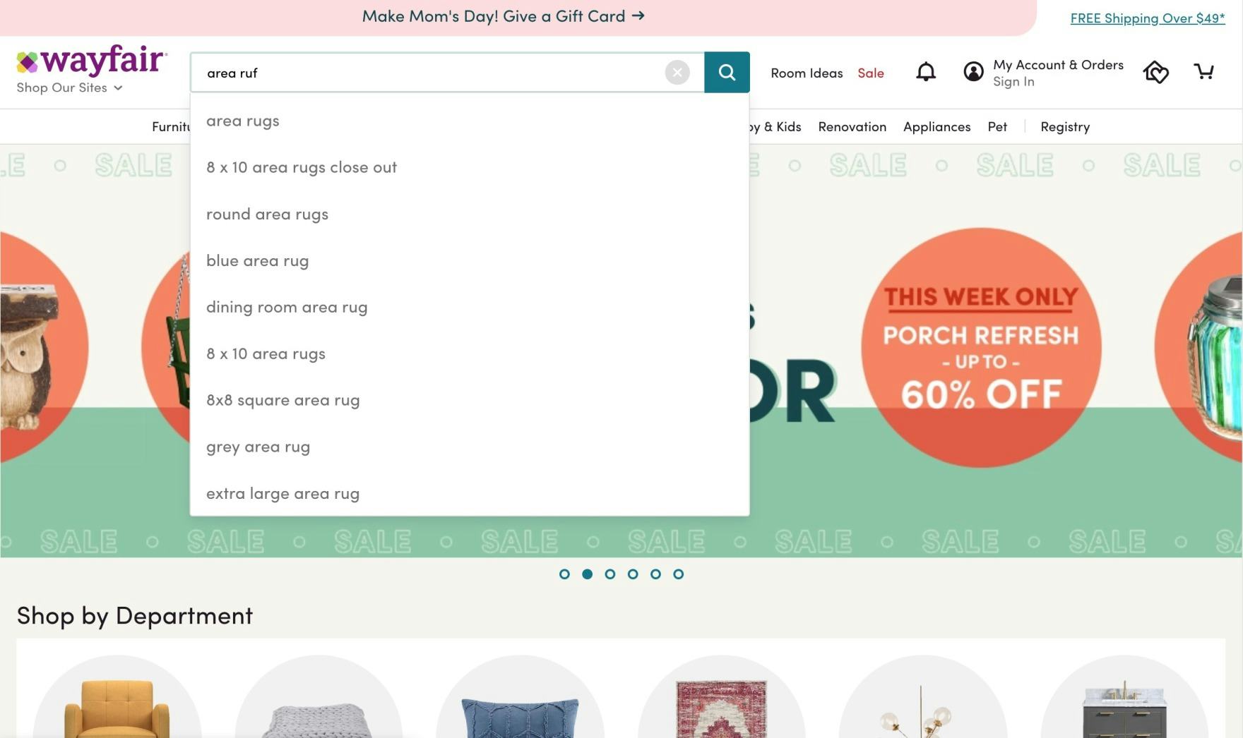
At Wayfair, a query intended to find “area rugs” includes a typo where a simple swap of adjacent characters was entered (“area ruf”) — yet autocomplete still offers relevant query suggestions, with the corrected match at the top of the suggestion list. Having obvious misspellings mapped to corrected suggestions can allow users to reach products without additional effort to revise queries.
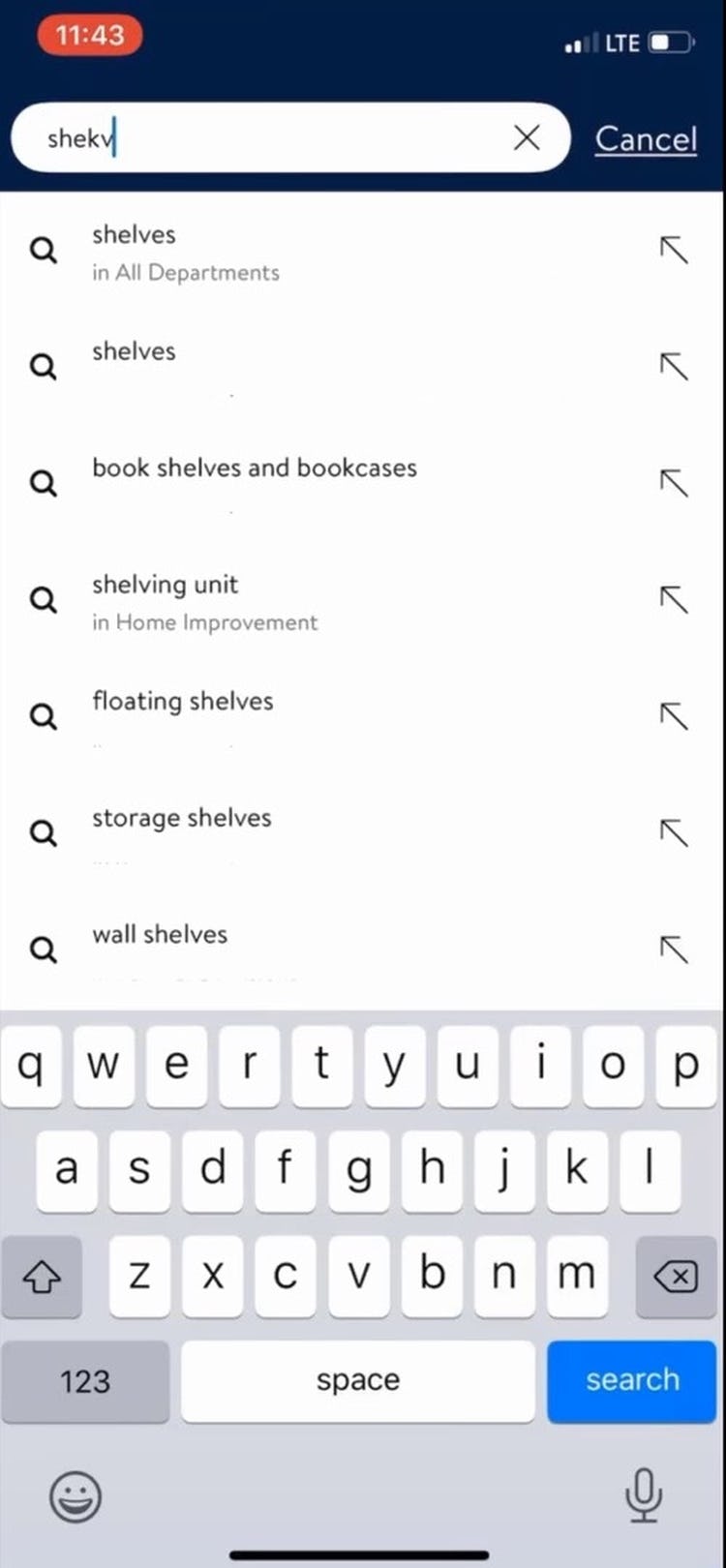
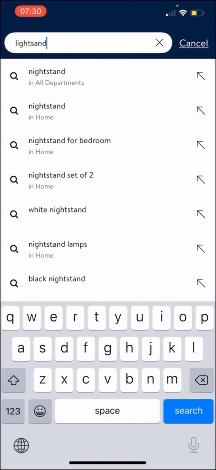
Autocomplete suggestions in the Walmart app proved useful for 2 participants during testing, as autocomplete coped well with “shekv” (first image) and “lightsand” (second image) by providing suggestions in line with users’ intentions.
Since spelling errors in search queries do occur with significant frequency, autocomplete’s relevance can be enhanced by mapping misspelled words to meaningful autocomplete suggestions.
Historically, non-AI spell checking solutions could be applied to ecommerce search and manually tweaked for particular industries according to commonly misspelled words.
At many companies now, search autocomplete is performed by services that use AI such as Algolia, Meilisearch, Elasticsearch, Typesense, and Coveo, which still allow for both automatic and manual mapping of users’ misspelled words into the most likely term.
Whatever route you choose, using a finely tuned autocorrect can make it easier for users to find what they want and avoid the sort of autocomplete mistakes that led to abandonments in our testing.
2) Have a “View All” Option in the Main Navigation at Each Level of the Mobile Product Catalog (33% Don’t)
While search is crucial in helping users find what they want, navigation is also very important.
For example, our survey findings reveal that 37% of respondents said they use a site’s navigation when casually browsing for products with certain specs or features, and 31% said they use a site’s navigation to browse for a visually driven product (2025 survey of 1,167 online US shoppers).
On desktop sites, users often have an option of getting a broad scope of products by selecting the top-level scope in the main drop-down navigation, an option that’s indicated to users by the hover cursor change.
However, this is not the case on mobile devices.
On mobile, due to the lack of a hover state, Mass Merchants have to determine whether a user tapping a main category should expand the subcategories within it, or take users to the landing page for the main category item (e.g., a broad product list or an intermediary category page).
One design pattern that can allow users to access a broader scope on mobile is to allow them to tap the header for the category they’re currently in.
However, during testing participants failed to tap the header of the currently viewed category to get a broader list of products — even when participants wanted the broader list — when the header was simply the name of the subcategory (e.g., “Makeup”, “Tops”, etc.).
Another approach is to use multiple hit areas within each main navigation item, such as letting users tap a header (such as “Tops”) to see a broad product list, or tap an arrow at the end of the row to expand subcategories (like “Dress Shirts,” “Casual Shirts,” “Sweaters,” etc.).
But this design relies on very subtle cues which many participants missed, some because they were unfamiliar with the concept, others because they encountered it inconsistently across sites — or even within the same site.
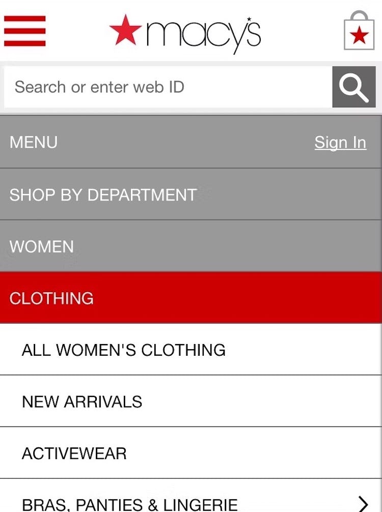
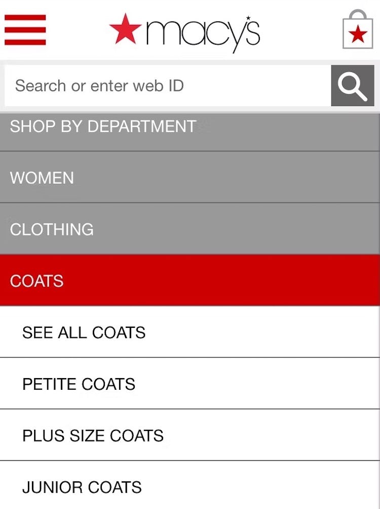
Macy’s includes “View All” nested menu options at different levels in the category hierarchy.
What was observed to perform consistently well was having a “View All” menu item nested within every product category in the hierarchy.
For example, a site with the category “Women” and the subcategories “Clothing” and “Coats” would have a “View All” menu item at each level — thus, “View All Women’s”, “View All Women’s Clothing”, “View All Women’s Coats”.
If product lists at the very top of the hierarchy would likely be overwhelming or unhelpful to users, then “View All” could take users to Intermediary Category Pages instead.
However, note that the key is to have the words “View All”, “See All”, etc. preface the name of the subcategory users are currently in.
Implementations that simply read, for example, “Jeans”, instead of “See All Jeans”, will be overlooked by most users, who won’t understand that the header “Jeans” can be tapped to see the broadest “Jeans” path available.
This also means, however, that if the current implementation allows users to see all the products in a subcategory by tapping its header, then correcting this is as simple as adding the text “View All” or “See All” to all relevant headers.
Additionally, the “View All” option should be placed as the first menu item in the list (i.e., at the top), as testing revealed that placing it elsewhere made it harder for participants to find.
Furthermore, having “View All” at the bottom or in the middle of a list breaks with the typical information architecture for a nested hierarchy, where the parent item will always come before the children nested within.
Strategically using “View All” and an autocorrect that accounts for users’ typos can help users navigate to products, but challenges remain once users arrive at those products and begin to analyze relevant product information.
3) Include Product Attributes Consistently Across List Items (68% Don’t)
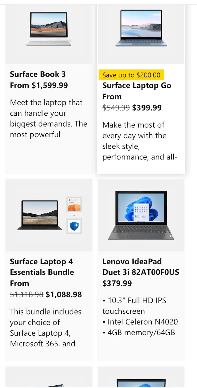
On Microsoft, only the product at the bottom right shows product specs, making proper comparison between items impossible without visiting product pages.
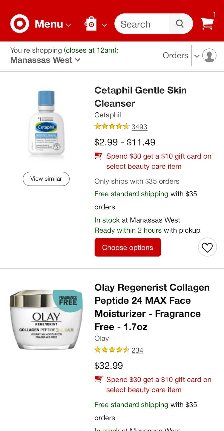
Likewise, on Target, the upper list item contains no product attributes, while the second contains information on ingredients, fragrance, and how much moisturizer is included.
During testing, many participants dismissed items that didn’t show the same attributes that were present in other list items for similar products.
This is highly problematic since users are effectively excluding a large number of perfectly relevant products simply because they can’t see a specific product attribute in the product list item info.
In testing, a lack of consistency for list item attributes indirectly caused multiple site abandonments because the participants assumed the site didn’t carry enough relevant products.

Here the information about these Williams Sonoma coffee makers is subtly uneven: all have a brand, model name, and capacity, but the Cuisinart lacks a color descriptor and the West Bend does not indicate what type of coffeemaker it is (e.g. drip, percolator, or urn).
Inconsistent inclusion of product attributes across list items may happen for a number of reasons, including the following:
-
Information is unknown. Sometimes all product attributes simply aren’t available for all products in the list; for instance, a site might not have “Touchscreen” information for all their laptops.
-
Information is unstructured. A common cause for list item inconsistencies is that the product attributes aren’t stored in a consistent structure. Inconsistently included information was the most common issue observed during testing, where the needed attributes were available on product pages, but weren’t consistently included in list items.
-
Information is controlled by vendors. Product vendors typically want to highlight specific information about their products; hence, they will tend to highlight different specs and benefits in list items if they are allowed to control this information (e.g., if they supply the “product summary” description).
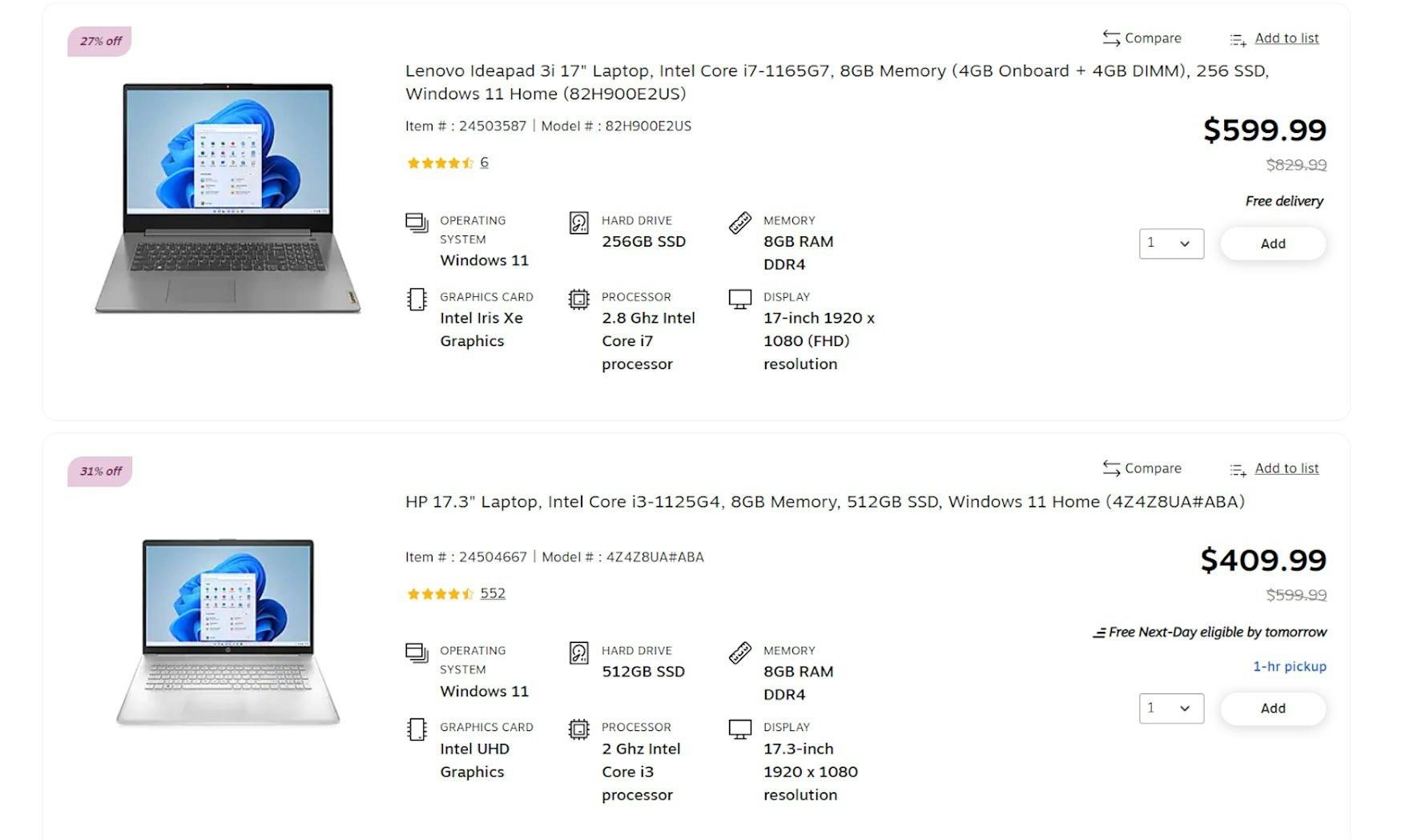
“The way this is presented is pretty nice. You have all the specs here laid out and organized — operating system, graphics card, memory, display, processor. Yup, very nice.” With consistently available laptop attributes on Staples, users will have little difficulty comparing key specs.
Therefore, it’s critical to make sure the same attributes are included consistently across similar list items in the same product list.
Depending on the underlying issue, the solution may be approached in 1 of 3 ways:
-
If the information is unknown, there are two solutions: either don’t display the unknown information in any of the list items, or explicitly state the attribute’s unavailability for the products where it’s missing rather than hiding it altogether.
-
If the information is unstructured, rigorous internal structuring of data or well-defined tagging is needed to ensure that product data is pulled in a dependable manner.
-
If the vendor controls the descriptions, the solution is to keep tight control over the very limited information that is displayed in list items and not simply use vendor-supplied product summaries or highlights.
Adopting these solutions allows users to easily and quickly compare these attributes at a glance across multiple items (see also Combine Variations of Products into One List Item).
4) Use “Delivery Date” Rather Than “Shipping Speed” When Predicting Package Arrival (37% Don’t)

Foot Locker provides options for shipping during checkout, but puts the burden of estimating an arrival date on the users.
Another source of confusion comes in the fulfillment of an order, specifically when users should expect to receive their package.
Unfortunately, the variety of products that Mass Merchant sites sell leads to a variety of delivery speeds, not all of which are easy to understand.
The solution historically used within ecommerce is to clearly state the shipping speed for each of the shipping options: for example, “Standard: 2 Business Days – $4.95”.
However, across multiple rounds of Baymard’s large-scale checkout UX testing, we’ve consistently observed participants come to a complete halt in an attempt to extrapolate or guesstimate when their order would arrive when provided with only the shipping speed.
This halt often led to hesitation and even cart abandonment when timeliness was of utmost importance.
With only shipping speed or name provided, users will have to consider elements that may be unclear, unstated, ambiguous, or widely varying from site to site, such as:
- Whether the site also needs order-processing time (e.g., “Ships within 1 business day”) and, if so, if this is included in the shipping time or not
- The order cutoff time and whether today counts towards the posted shipping timing
- The exact definition of a “Business Day” and whether any weekends or holidays fall within the delivery range
This approach proved to be a very business-centric way of conveying this information, with participants often arriving at different estimates based on differing assumptions or misunderstandings of key factors (e.g., if Saturday counts as a “Business Day” or if the order would be processed today or tomorrow).
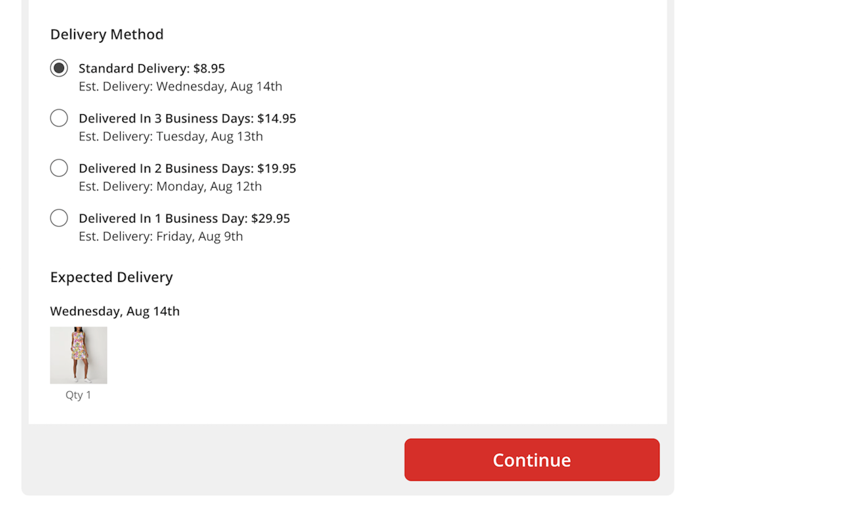
On JCPenney, the estimated delivery date is listed below each shipping option, so users can easily assess and compare the available options.
To provide precision and clarity for users concerned over when they will receive their order, sites should instead provide an estimated “Delivery Date” for each option directly within the shipping-selection interface.
By calculating the anticipated delivery date, sites can remove a sizable burden from users, as they won’t have to calculate things like:
- the order cutoff day
- whether there are any holidays coming up
- whether any of the available delivery methods deliver on Saturdays or not
- whether the site has any order-processing time
- how long order processing might take
- whether the site’s internal cutoff time for processing orders has passed or not
Rather, all they will have to consider, for example, is whether they want to pay $2 extra to receive the order “Thursday, April 2nd” rather than “Saturday, April 4th”.
To further facilitate comparison, the estimated delivery date should appear prominently alongside the cost of each option (including on the product page if possible; see “Product Pages Need to Show ‘Estimated Shipping Costs’”) directly on the page within checkout.
Importantly, participants in testing interpreted the delivery date provided by the site as a clear promise or guarantee of delivery by that date.
To ensure sites can deliver on the expectations set by an estimated delivery date, delivery date calculations should dynamically update to reflect known reasons for possible delays, including extra order-processing time during peak periods, supply issues or backorders, handling time, holiday delays, customs processes, etc.
This is particularly important for sites with a high proportion of gift orders, as well as orders around the holiday shopping season, when users’ concerns for timely delivery are particularly high (see also “Users Overlook ‘Store Pickup’ When Not Presented as a Shipping Option”).
Making a Mass Merchant Site Feel Both Wide-Ranging and Intuitive

Here Tesco not only provides the same product attributes within an area like ice cream, they also provide the same product attributes across all of frozen food: the brand, the product name, and the amount).
These often-violated best practices are only the start of Baymard’s research-backed guidelines for successful Mass Merchant sites.
Indeed, the best practices above are from only 4 of the 500+ guidelines for Mass Merchant ecommerce sites.
Still, these practices smooth users’ journey in ways that many Mass Merchant sites do not, making them targets worth pursuing:
-
Offer relevant autocomplete suggestions for closely misspelled search terms and queries (69% don’t)
-
Have a “View All” option in the main navigation at each level of the mobile product catalog (33% of sites don’t)
-
Include product attributes consistently across list items (68% of sites don’t)
-
Use “Delivery Date” rather than “Shipping Speed” when predicting package arrival (37% of sites don’t)
The challenges facing Mass Merchant sites are substantial — somehow the sites must both expose users to the variety of products the site sells while assuring users that it will not be challenging to find exactly what they want.
Mass Merchant sites ideally improve upon the kind of experience a user can have at a brick-and-mortar business, and the tips offered here ensure that your Mass Merchant site will provide UX that feels more like an expertly handled sale with an experienced personal shopper and less like a meandering trudge through a messy secondhand store.
Getting access: all 500+ Mass Merchant UX guidelines are available today within Baymard. (If you already have access through an account, open the Mass Merchant Study).
If you want to know how your Mass Merchant desktop site, mobile site, or app performs and compares, then learn more about getting Baymard to conduct a Mass Merchant UX Audit of your site or app.