Key Takeaways
- The order confirmation page is too often a dead end for users
- The confirmation page can be a way to increase user engagement with your brand
- Cross-sells, newsletter sign-up, account creation, informational resources, apps and other promotions, and surveys can all be added to the confirmation page to reduce checkout friction and increase engagement
Turning visitors into customers is one of the primary goals of any e-commerce site, but what happens after they’ve successfully placed an order?
A user has just filled out numerous form fields and spent their hard-earned money on your site — what a shame it would be to waste this great opportunity for customer engagement by simply redisplaying the order information on the order confirmation page: “Thank you for your money — off you go”.
Instead, Baymard’s large-scale testing shows that the confirmation page can offer users useful information and actions that can improve engagement and long-term retention.
In this article, we’ll discuss our Premium research findings on 6 ways confirmation pages can be leveraged to help users after their purchase is complete.
1) Cross-Selling
The appeal of cross-selling is obvious — but throwing a bunch of deals in users’ faces just after they added a product to the cart can also scare users away and get in the way of actually buying the product.
By moving cross-sell deals to the order confirmation page you get the best of both worlds: a chance to offer additional products but without interrupting or scaring away users who want to buy from you.
By placing cross-sell deals at the order confirmation page itself users can add products to their order without having to resubmit any payment data.
Each cross-sell deal could have an “Add to order” button, allowing users to purchase them with as few taps as possible.
You may even add a sense of urgency by informing users about the limited time window they have before the order is processed — for example, “In the next 5 minutes you can add one of these super deals on accessories for your XYZ product at a 25% discount”.
While requiring a bit more technical integration this is a powerful way to cross sell additional products in a truly seamless manner while also simplifying the checkout process.
2) Newsletter Sign-Up
There’s really no need to distract users with newsletter sign-up as they’re working their way through your checkout form — instead, ask on the order confirmation page, after they’ve completed the purchase.
Since you already have the email address, the implementation can be very simple, with a link or button that a user simply clicks to subscribe (or unsubscribe, if the default is subscribing, though we can’t recommend that approach).
Alternatively, you can have a prefilled email field (so the user can use another email address — particularly useful for B2B audiences).
One major advantage of moving the newsletter sign-up to the order confirmation page is that you have much more space to promote the benefits of the newsletter.
Traditionally, when newsletter sign-up is part of the checkout process, you have to balance advertising the benefits of the newsletter with the clutter added to the checkout form.
On the order confirmation page, you don’t have this same struggle and can dedicate an entire section of the page to the advantages of newsletter sign-up.
If you have multiple newsletters, this only compounds the benefit of moving sign-up to the order confirmation page.
3) Account Creation
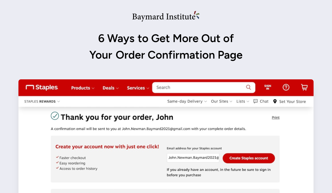
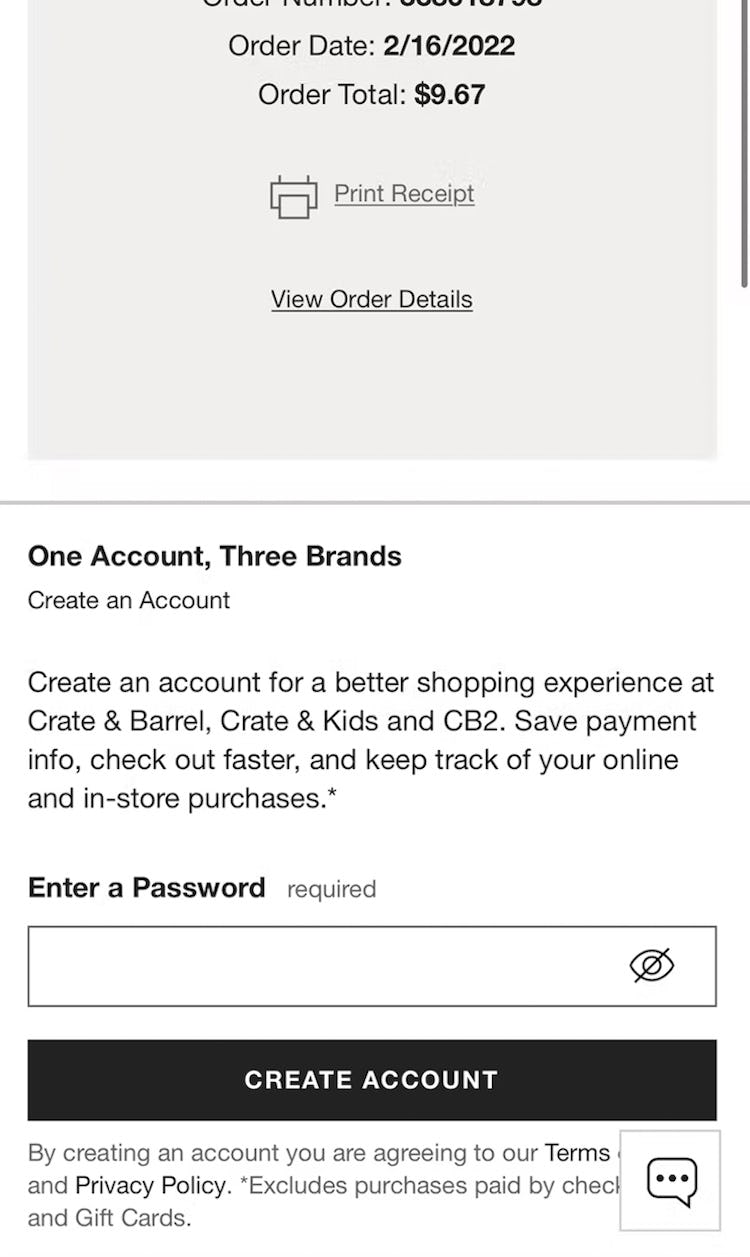
Staples (first image) and Crate & Barrel (second image) make it easy to create an account on the confirmation page, allowing users to create an account in only one click.
Moving account creation to the order confirmation page vastly simplifies the checkout process.
Indeed, saving account creation for the confirmation page cuts out steps and the complex thought and decision process users would otherwise initiate: “Which password should I use? Do I trust this site to store my information securely? Do they also store my card? Do I want an account here? Do I want to be affiliated with this company? How often will I shop here again? Will they automatically send me a lot of newsletters?”
Like newsletter sign-up, we once again also reap the benefits of additional space for promoting the benefits of creating an account.
If you use the user’s email address as their username the implementation can be very simple too: just a single password field.
However, in some cases it may still be preferable to include account creation in the checkout process, depending on the industry.
For example, for a SaaS product an account can be a very integrated part of the product. In such cases placing the account creation in the checkout process might make more sense (although not always).
4) Informational Resources
Some sites may benefit from providing users with additional information about their order immediately after their purchase — as shown here at Sea Paradise (tour itinerary details, first image) and Burger King (map of the delivery, timeline, and courier contact method, second image).
The order confirmation page is the perfect place to have informational resources related to the ordered products or services.
For example, itinerary or delivery details could be provided for users shopping for tours and experiences or ordering takeout.
Confirmation pages can also offer guides and “how-tos”; for example, for an espresso machine purchase it could be a video guide on “Brewing the perfect cup of espresso”, for a road racing bike it could be a 2-page guide on proper care and adjustment of the gears, for software it could be video tutorials, and so on.
Anything that makes the user feel more confident in the purchase is good and can lower canceled orders — not to mention create a delightful purchasing experience and make sure the user can hit the ground running as soon as the order is delivered.
There’s obviously some work involved in creating content and mapping it with the appropriate products.
However, it can also be what sets you apart from the competition in a crowded marketplace (especially for DTC or smaller sites) — showing that you actually care about the user and her experience with the product(s) she just bought from you.
When executed right, this unexpected and valuable content can create that most rare of things: delight in an online checkout experience.
For an e-commerce store with thousands of products, this might not be feasible to do for each product, but you can start out by creating resource content for each of your top 5–10 product categories or best-selling products.
Also, you may source content from hobbyists who post guides on personal blogs, forums, YouTube, etc.
It’s understandable that sites want to promote their apps to users — but doing so during product finding can be tremendously distracting.
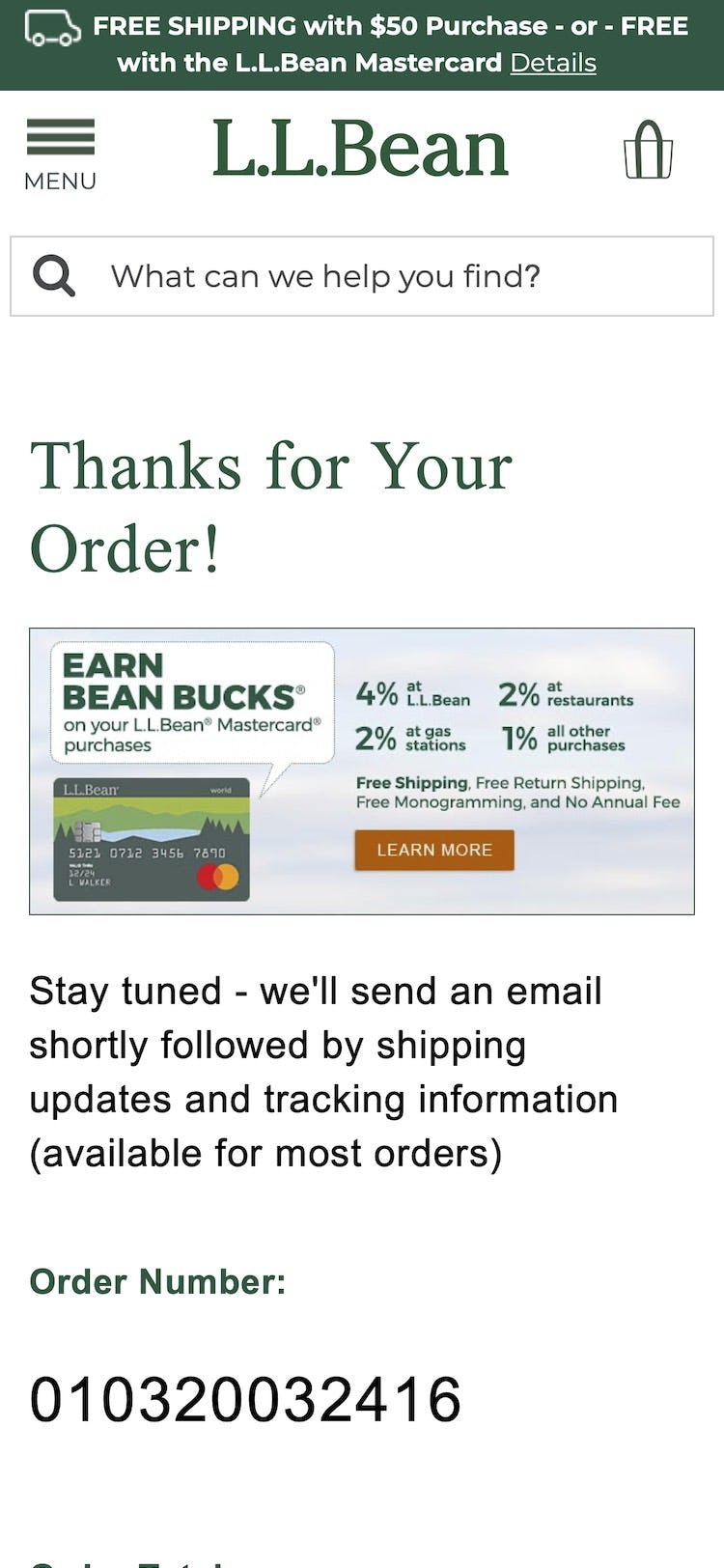
At L.L. Bean (first image), users are offered a store credit card, while at Domino’s Pizza (second image) a CTA for applying to be a delivery driver is promoted.
Similarly, ads and other promotions are typically ignored or frustrating for users while they’re in the process of shopping for products or checking out.
On the confirmation page, on the other hand, if a user becomes frustrated by a promotion they can simply leave without jeopardizing the sale.
Additionally, you may ask users to engage on social media by following your brand on X or liking it on Facebook, Instagram, etc.
6) Surveys
At Neiman Marcus (first image), users are asked to describe why they bought a product, while Tirerack.com (second image) provides checkboxes to elicit how users heard about the brand.
What users are thinking right in the moment of purchase is presumably of great interest to any e-commerce owner — so why not ask them?
For example, simply have a text field on the order confirmation page asking the user whatever it is that makes you stay awake at night.
Or ask a single question that users can answer in a single tap.
In short, getting users to respond to your question will likely be easier if the time requirement from them is as minimal as possible.
Get the Most Out of Your Confirmation Page
So there you have it, 6 suggestions for getting more out of the order confirmation page:
- Cross-selling
- Newsletter sign-up
- Account creation
- Informational resources
- Apps and other promotions
- Surveys
These suggestions aren’t meant to replace the order confirmation itself — you should always clearly show an order summary, expected arrival date, and have a short note stating that the confirmation has also been emailed to the user.
Rather, these suggestions should be seen as supplemental components that can reduce checkout friction and further engage the customer.
Depending on your industry, it’s important to experiment and test out different combinations: are there unique opportunities you can capitalize on, creating delight and increasing revenue?
If so (and there likely are), the order confirmation page is a perfect place to provide these to end users.
This article presents the research findings from just a few of the 650+ UX guidelines in Baymard Premium – get full access to learn how to create a “State of the Art” e-commerce user experience.
If you want to know how your desktop site, mobile site, or app performs and compares, then learn more about getting Baymard to conduct a UX Audit of your site or app.

