Key Takeaways
- Third-party payment methods need to be provided and can help reduce checkout abandonment
- However, our testing revealed that some payment selector UIs can cause user confusion and choice paralysis
- Off-site third-party payment flows can be misunderstood and so need to be explained clearly
- Sites should provide payment methods commonly used in each territory they sell in
If users have no way of paying you, they have no way of buying anything from you, and so it’s clear that accepting a wide range of payment methods is a good idea to ensure that all users can send money your way.
In fact, third-party payment methods are available on the vast majority of sites, with 89% of our benchmark sites offering at least one alternative to credit card payments.
Furthermore, our 2021 quantitative study of the reasons for cart abandonments found that 7% of users had abandoned a checkout during the past three months because the site didn’t offer their desired payment option.
Yet, over multiple rounds of checkout testing, we observed how just presenting multiple payment options without carefully designing the payment method selector UI can introduce complexity to the checkout process, and can lead to choice paralysis.
Additionally, users misunderstanding the third-party checkout flow can result in both premature abandonments and orders being inadvertently left uncompleted.
In this article we’ll cover some of the research findings from our large-scale usability testing that reveal how to design payment selectors and explain third-party payment flows, as well as outlining both why and which third-party payment methods are needed:
- How to Design the Payment Selector UI (Mobile and Desktop)
- Explaining the Third-Party Payment Flow
- Why Third-Party Payment Methods are Needed
- Local Payment Methods
- Conclusion: Ensuring Users Can Easily Select a Preferred Payment Method
How to Design the Payment Selector UI (Mobile and Desktop)
During testing, users were intimidated, experienced choice paralysis, and were slowed down considerably by payment interfaces cluttered with different payment options.
It was clear that how different payment methods are presented to users has a large impact on how easy it is for the majority who still just want to proceed to pay with a credit card.
In fact, having “credit card” as the default payment method is particularly important as many users will not be familiar with third-party options.
The optimal solution requires a progressive disclosure design, where only the description, fields, and buttons for the selected payment method are shown to users, and all content for the nonselected methods is collapsed.
For users who don’t know or fully understand the third-party options presented, it will add significant friction to the payment method selection process to ask users to perform an active choice; for example, to have to actively find and select the credit card option.
We’ve consistently observed during testing that having a default selection that suits the majority will be seen as a clear “safe choice” that the site recommends users to take — and they’ll consequently spend significantly less time and energy focusing on alternative methods.
Beyond having the most popular choice as the default selection, the interface needs to account for the fact that each of the payment methods will have different fields, descriptions, and even flows associated, which are only relevant to users who select that one payment option.
For example, third-party payment options that direct users to the third-party site will require an explicit description of the following third-party flow along with customized primary button naming see below.
During testing on both desktop and mobile sites, certain payment selector design patterns were observed to work much better than others.
Payment Selectors on Desktop
Some design patterns caused unnecessary delay and difficulty for users. For example, radio button proximity is almost impossible to ensure when offering a default selection that expands to reveal a large section of nested content within.
Additionally, users are prone to overlook alternatives when drop-downs are used as selectors.

For a vertically tabbed design, all payment methods and their labels are stacked vertically in a small left-hand column, and the main center column then contains the expanded content for whatever option is selected.

For a horizontally tabbed design, all payment methods have a single horizontal line above the expanded content for the selected option.
The best-performing payment methods interfaces observed in desktop testing were tabbed designs — either horizontally or vertically tabbed.
Tabbed interfaces have two benefits that make them well suited for payment method selections:
-
Regardless of how much content each option contains, the options themselves will always stay in close proximity, clarifying to users that this is an interface where one selection has to be made among a list of two or more mutually exclusive options.
-
A default choice — typically credit card — with expanded fields provides a clear path for users who may be slightly in doubt, while still keeping the alternative payment methods clear to users who know which alternative they are looking for.
The tabbed designs were, during desktop testing, strongly confirmed to perform well across the board, causing almost no friction at all for the uninitiated users who preferred just proceeding with the default credit card method.
Crucially, at the same time, users wanting to pay with an alternate payment method had no issues finding their preferred payment method.
Note, however, that, while both vertically and horizontally tabbed designs can perform well, vertically tabbed designs can hold a large number of options (e.g., 6 or more), whereas the horizontal approach is less suitable for a very large number of payment methods.
Finally, if only a single payment method is available to some users (e.g., in some countries), then the entire selection interface should be dynamically removed, as those users can no longer make a choice.
Payment Selectors on Mobile
In contrast to the desktop experience, during mobile website testing a number of payment selector designs were observed to work well, with no user encountering any usability issues.


When there’s just one third-party payment option, simple radio buttons arranged either vertically (e.g., Neiman Marcus, first image), or horizontally (e.g, Target, second image) worked well as payment method selectors in mobile testing. Note how credit card payment was the default method in both cases, suiting the majority of users.

When a site offers multiple payment methods, such as Musician’s Friend, selection “buttons” worked well.

Williams-Sonoma provides radio buttons — that include logos — as payment selectors. Credit card payment is a clear default, but third-party payment methods are easy to find and select.


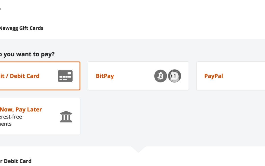
This vertical radio button design on NewEgg also worked well in testing. Note how the primary button changed from “Place order” (first image) to “Pay with PayPal” (second image) once this user selected his preferred payment method.
In fact, all of the mobile payment selector designs above allowed test users to quickly ascertain which payment methods were available, and to choose that which was most suitable.
Note how all of the payment options are visible in one viewport, and the designs convey clearly that users need only to choose one.
Indeed, on mobile the viewport constraints that limit the design of payment selectors may actually benefit users. Choices of payment types dominate the viewport, unlike on desktop where many page elements are vying for attention.
However, during mobile testing in particular explanations of third-party payment flows were generally absent, making it difficult for users to know beforehand what would happen when they selected a third-party option.
Explaining the Third-Party Payment Flow

“I see that there is a PayPal checkout. I don’t know, I think it would redirect me to PayPal right away before being able to review again.” Uncertainty with how the PayPal checkout would work in the absence of any explanation made this user on the German site Cyberport reluctant to use that checkout option.

“Um. It says this is ‘Not Available’. I just don’t know. ‘Number’, ‘Name’ . I’ll just try to click this one to see if I can sign in some way.” This user was confused by the lack of guidance about how the PayPal payment flow would work. “Well…now I’ll just try to click ‘Place Order’ then we’ll have to see what it says”.
During testing, we observed that some users with third-party accounts had an existing mental model and expectation of how third-party payment flows worked, while others didn’t.
To complicate matters, the third-party payment flows may change depending on the specific site implementation.
So even if users have prior experience using third-party checkouts, they may still be exposed to a new flow.
In fact, during testing, of the users who were existing third-party payment users, 19% misunderstood what would happen next when opting to pay with a third-party payment method.

“I should go straight to PayPal. I will be forwarded to PayPal when I click ‘Next’.” The explanation of the third-party flow on the German site Zalando was sufficient for this user to be sure about what would happen if she took that option.
To alleviate these issues, sites should explain how the third-party flow works within their particular checkout process.
Yet 14% of desktop sites in our benchmark don’t offer any description of the process.
Much of the issue comes down to the fact that there are two different flows often found in third-party payment integrations.
-
Flow 1: Many sites don’t immediately send the user to the third-party payment site. Instead, they allow users to “complete” the site’s checkout flow first and, as a last step, send users to the third-party site to pay for and place the order.
-
Flow 2: Other sites, however, inject an external checkout flow into their own existing checkout flow. For example, a user will go from the e-commerce site to the third-party payment site to authenticate themselves, and then return to the site to finalize their purchase.
The difference in how third-party checkout flows work can be confusing or intimidating to users if the flow isn’t explained.
While testing didn’t reveal one flow to perform better than the other, it did clearly reveal that all third-party payment flows need to be described.
Regular third-party payment users who expect a certain flow, but are presented with a different flow, may wonder why it is different — for example, if users are expecting to be sent to a third-party site, but instead are sent onwards in the site’s own checkout flow.
Conversely, users who aren’t used to third-party payment flows may be uncomfortable when the site sends to a third-party payment site to sign in.
Therefore, given the diversity both in what users expect and in what flow sites opt to use, a brief explanation of the forthcoming flow is necessary, provided either inline or with a tooltip.

“‘Continue to Step 3’. Huh? Ah yes. I assume that ‘Step 3’ means the button placed above Step 3, that’s a bit stupid.” This user was confused by how American Eagle attempted to describe the checkout flow for PayPal: “You have chosen PayPal as your payment method. Continue to Step 3 where you will be able to Login to PayPal and complete your order”, which is written from a site-centric perspective that assumes users know what step they are currently on.
Some sites do attempt to describe how the third-party payment flow will work. However, during testing, the descriptions weren’t always helpful, particularly if written from a site-centric perspective.
Poorly written microcopy, combined with an unconventional third-party checkout flow that isn’t explained to users, can lead to a confusing experience where users feel they aren’t in control of the checkout and payment flow.
On the other hand, ensuring that the microcopy for the payment options is dynamic and represents the individual user’s selections goes a long way in clarifying the third-party flow.
Additionally, it’s important that, along with descriptive microcopy, the primary button dynamically adapts to the user’s chosen payment method.
During testing, some users had to simply guess at which were the correct buttons to click to proceed with the checkout.
A lack of clarity about the function of buttons can lead to critical errors, such as placing an order unintentionally, or the reverse, prematurely abandoning an order that was assumed to be completed.
If primary buttons don’t dynamically adapt to users’ input, the button text may not match their current flow and intent.
For example, when users see the button text “Review Order”, they are unlikely to expect to be taken instead to a third-party payment provider.
The same goes for generic button microcopy like “Next Step”, which doesn’t provide users with much in terms of useful information.
On the other hand, button text like “Proceed to PayPal” makes it crystal clear what will happen if the button is clicked.
Why Third-Party Payment Methods Are Needed

During our quantitative study of reasons for checkout abandonments among 4,329 US online shoppers (2021), 7% had abandoned a checkout during the past three months because the site didn’t offer their desired payment option.
Indeed, the fact that 89% of sites offer at least one alternative to credit card payments demonstrates that a significant subgroup of users have a strong preference for using third-party payment options.
Furthermore, 4% of users abandoned checkouts because their credit cards were declined, an issue that could have been rectified by the availability of third-party payment methods (which can act as fallback option when the users card is declined).
The widespread adoption of third-party payment methods can be explained by three distinct benefits they bring:
1. Facilitating users’ preferences. Users may prefer certain payment methods over others for any number of reasons, ranging from privacy concerns, to simplicity and speed, to how secure they believe an option to be.
2. Declined payments. Potential abandonments due to credit card declines — resulting from issues such as accounts having insufficient funds, technical issues with providers, or expired cards — can be avoided by providing fallback options.
3. System redundancy. The more payment methods you accept, the more redundancy there will be in your payment system should one of them break down temporarily or have to be taken down for maintenance.
It’s therefore critical to offer one or more third-party payment options.
However, it’s important to note that the majority of users are perfectly happy with just using their credit cards, even among those who have tried third-party payment options before. Thus, it’s important that the payment method selection interface is carefully designed to avoid unnecessarily complicating users’ payment selection.
Local Payment Methods
Providing descriptions of how third-party payment selections will work during checkout is important to ensuring users are comfortable selecting a third-party option.
However, that begs the question, ”What third-party payment options should be provided?”
While there are several international third-party payment methods like Apple Pay, Google Pay, Visa Checkout, MasterPass, Amazon Pay, and Alipay that compete for space with established third-party services like PayPal, there are also local payment methods — specific to individual countries — that users are likely to expect.

The importance of providing country-specific third-party payment methods is underlined by Stripe’s 2020 sales data for all Stripe merchants’ transactions in 5 European countries. Adding a local third-party payment method resulted in a significant increase in sales.
Indeed, the importance of offering locally relevant third-party payment options is emphasized by statistics from Stripe that demonstrate sales uplifts of between 6% and 45% after payment options were added.
Examples of other popular payment methods include Cash On Delivery in several eastern European countries; Giropay, SEPA, and invoice payment in Germany; and iDeal in the Netherlands.

In Germany, popular alternative payment methods, such as those shown here on Notebooksbilliger.de, include “Payment in advance” (bank transfer direct from users’ accounts), GiroPay (bank transfer via a third-party service), Klarna (purchase on invoice and pay later), and Amazon Pay. Credit card payments are less popular in Germany than in markets like the US and UK.

Alternatives to credit card payments on the German site Zalando include an invoice option (with payment due within 14 days), PayPal, and bank transfer.

Payment methods in Scandinavian countries (such as on the Danish site Hi-Fi Klubben) include “Pay in 30 days” using Klarna, “MobilePay” (payment from bank accounts using an app, which was particularly popular during testing), and “EAN Faktureing” (a special form of invoicing that is used for the public sector as well as certain companies).

Paying by installments, as on Boohoo (UK), was quite commonly observed on UK sites.
Many sites do offer local third-party payment options — during our testing of European e-commerce sites, users could choose from many payment options besides credit card, such as the following:
- Via an account accessed on a mobile app
- By invoice with payment within 30 days
- By bank transfer, either directly from the account or through third-party providers
- By installment payment facilities provided by third parties
Ensuring Users Can Easily Select a Preferred Payment Method

The horizontally tabbed payment selector on Gucci makes it easy for credit card users to complete payment, and offers two other options that are easy to find and that don’t clutter the interface.
Selecting a payment method is a crucial step late in the checkout process that has to be optimized both in terms of the payment methods available and how the selection interface is designed.
Beyond those users that simply prefer a third-party payment method, offering third-party payment options caters both to the 7% of users who will abandon their purchase if third-party payment isn’t an option, and also to the 4% of credit card users who experience validation errors and who may use the third-party payment option as a fallback payment method.
From a user and business standpoint, it’s therefore important to offer one or more third-party payment options as secondary choices, ensuring that all methods that are locally popular are present and that any alternative payment flow is fully explained.
Finally, using a horizontal or vertical tabbed design with the fields and descriptions hidden for all of the nonselected payment methods was observed during testing to be the best-performing design for payment selectors on desktop.
This article presents the research findings from just 1 of the 580+ UX guidelines in Baymard Premium – get full access to learn how to create a “State of the Art” cart and checkout user experience.