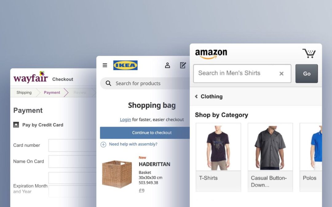
Mobile Touch Interfaces is one of the worst-performing topics for mobile websites: only 8% of sites offer “decent” or stronger performances, and 56% of sites have a “broken” performance.
On the positive side, almost all sites have optimized their content for mobile, including strong pinch-to-zoom functionality.
However, many sites struggle with these common violations:
12) 82% of Mobile Sites Don’t Provide Enough Space between Tappable Elements
A participant at Target unintentionally tapped a free shipping offer, which was placed immediately adjacent to the element he was trying to tap (the profile icon) (first image). He was then shown the free shipping overlay (second image). Unintentional taps such as this can lead to anything ranging from mild annoyance and slight detours (as in this case) to abandonments if users become completely disoriented.
The issue of spacing between tappable elements is closely related to the size of tappable elements (see below).
Both issues often combine to make it difficult for the end user to reliably navigate the Mobile interface (yet it should be noted that the two issues of sizing and spacing are unique and can occur separately).
In short, inadequate spacing between elements will lead to mistaps, unintended detours, and even abandonments.
Furthermore, inadequate spacing has been a persistent issue during all our Mobile testing: it has been observed extensively ever since our first Mobile testing in 2013, and remains an issue even today.
So what is adequate spacing? Some device manufacturer’s design guidelines stipulate a minimum spacing of 2mm and Baymard’s testing supports the same general recommendation.
However, in cases where the consequence of unintentionally tapping an element due to spacing issues are graver, spacing should be much higher (~10 mm).
Finally, elements should never be placed right at the very edge of the screen, as that area is typically unresponsive and users will thus have difficulty selecting those elements.
13) 88% of Mobile Sites Don’t Make Tappable Elements Sufficiently Large
A participant at Sephora struggled to tap the search icon, making several attempts before tapping directly on the magnifying glass. The hit area of the search icon is ~3.3mm x 3.6mm. Note that the main menu and shopping cart icons are similarly undersized.
Despite hit area sizing being a “basic” for Mobile design, we time and again observe sites implementing elements and links with overly small hit areas.
Again, just as is the case with inadequate spacing of elements, the disruption to the user can range from mild annoyance at having to tap multiple times before they hit the right spot, to severe frustration and abandonment if they mistap and end up in another area of the site or lose data (e.g., during checkout).
Yet the solution to these issues is straightforward: have at least a hit area of 7mm x 7mm (measured on the smartphone display).
14) 65% of Mobile Sites Don’t Use the Right Keyboard Layout for Relevant Fields
By changing an attribute or two in the code of the input fields, you can instruct a user’s phone to automatically show a specific type of keyboard that is optimized for the requested input.
For example, you can invoke a numeric keyboard for the credit card field, a phone keyboard for the user’s phone number, and an email keyboard for their email address.
This saves the user from having to switch from the standard keyboard layout and, in the case of numeric inputs, minimizes typos, as these specialized keyboards have much larger keys that reduce the chance of accidental taps.
Technically there are a few different ways to invoke the numeric keyboard layouts, and there are also slight distinctions between those keyboard layouts, with slightly different behaviors across platforms (iOS, Android, etc.).
In general, there are two HTML attributes that will invoke numeric keyboard layouts, namely the type and pattern attributes.
For example, for any numeric fields use
<input type="text" inputmode="decimal" pattern="[0-9]*" novalidate autocorrect="off" />
For a complete list of field and code combinations for all field types commonly found in a checkout flow, see baymard.com/labs/touch-keyboard-types.
15) 89% of Mobile Sites Don’t Disable Mobile Keyboard Autocorrect When Appropriate
Autocorrect is one of several mobile features that can assist (or, in some cases, hinder) a user’s typing, and is enabled or disabled in their device keyboard settings.
When enabled, it is supposed to automatically correct misspelled words as they are typed or submitted (e.g., correcting “camra” to “camera”).
However, autocorrect often works very poorly for abbreviations, street names, email addresses, person names, and similar words that are not in the dictionary.
We’ve observed how the keyboard autocorrect feature has caused significant usability issues throughout multiple years of Mobile usability testing, and has resulted in a great deal of erroneous data being submitted.
That said, typing is quite difficult on mobile and autocorrection does prove very helpful in scenarios when it corrects invalid input to valid input.
Therefore, autocorrect shouldn’t be disabled on all fields.
Instead use discretion and disable it on fields where the autocorrect dictionaries are weak.
This typically includes names of various sorts (e.g., street, city, person names) and other identifiers (e.g., email address).
Notice how Amazon’s mobile site hasn’t disabled autocorrect for the address field, causing users’ valid street name entries to be overwritten by keyboard autocorrect.
The keyboard autocorrect can however be disabled, ensuring that what users type is not overwritten — as seen here.
You can disable keyboard auto-correct by adding the autocorrect attribute to the input tag and setting it to off, like this:<input type="text" autocorrect="off" />
(Note: deciding what to do with regards to the search field is a complicated matter; Premium users see the last section in guideline #948.)
Of all the benchmarked sites, only IKEA shows a “perfect” performance in this topic.


