We’ve previously documented in our Checkout Study that 18% of users have abandoned orders because they couldn’t see order costs up front.
In this latest study of product pages, we found users are looking for shipping costs not only at the shopping cart or shipping methods selection step in the checkout, but that 64% of users are searching for shipping costs as early as the product page.
In particular, sites struggle with providing total order estimates and making return and “free shipping” info sufficiently prominent.
For inspiration on “perfect” Shipping, Returns, and Gifting implementations, see our benchmark reviews of Nordstrom, Home Depot, Overstock, Walmart, and Hayneedle.
7) Provide a “Total Order Cost” Estimate Near the “Buy” Section (56% Don’t)
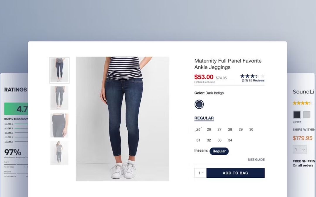
At Ann Taylor, users are given no estimation of the shipping price on the product page. When users don’t have any idea of how much shipping will cost on the product page, those costs may come as a surprise at checkout and will cause some users to abandon their order.
When users make purchases online, there can be a number of “hidden costs” that can quickly add up — for example, taxes, shipping costs, oversize item fees — and these costs can vary significantly from site to site.
If the total order cost is missing from the product page, users will have to take the extra step of adding the product to their cart to see this information (assuming it is provided at the “Add to Cart” step).
This quickly becomes tedious, especially as users compare products across sites and must take the extra steps of adding a product to the cart just to get an idea of how much their total purchase will cost them in the end.
On Boohoo (UK) during large-scale European testing, delivery options and costs were clearly shown. This allows users to calculate the total cost and assess the value of a faster delivery before adding items to the cart.
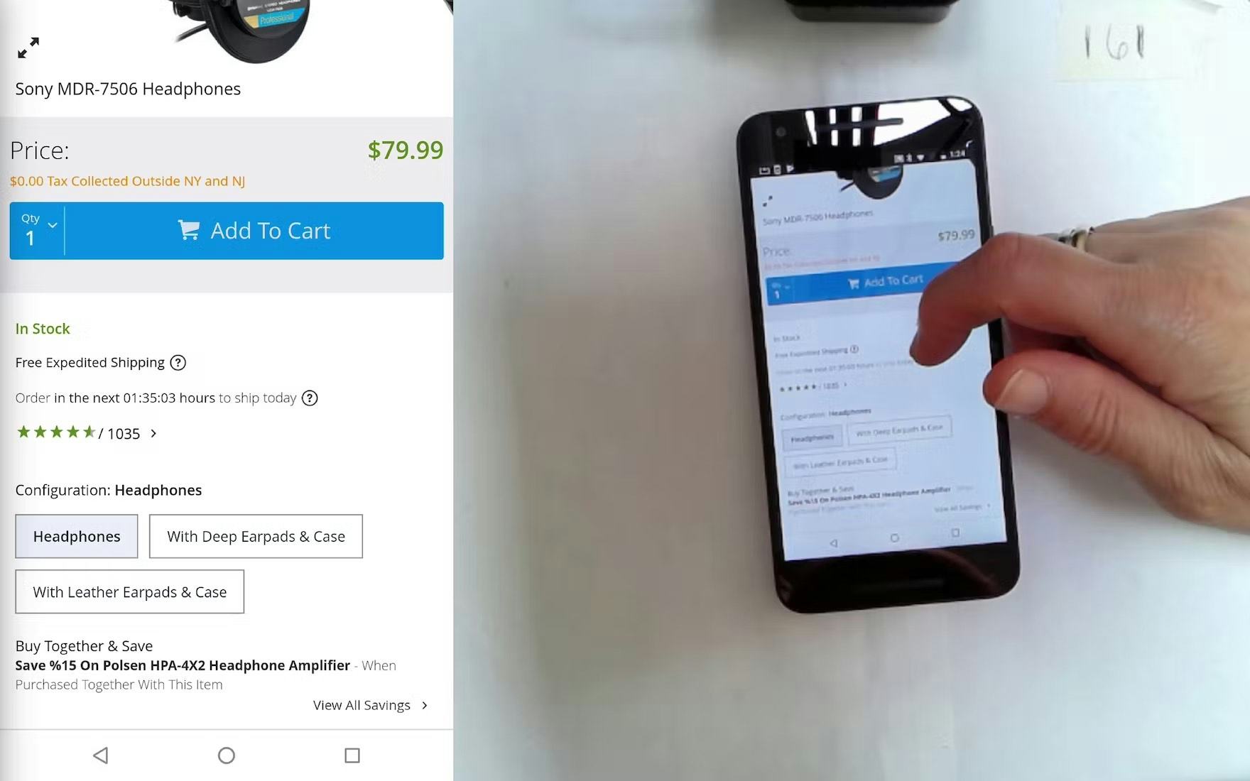
At B&H Photo, users are informed of the tax-exempt status of orders for most states (“$0.00 Tax Collected Outside NY and NJ”). Since most users will fall outside the affected states, letting those users know that sales tax won’t be added to their order during checkout is helpful for users in assessing their total order cost.
Instead, the lowest full order cost should be displayed on the product page by default; in particular, by showing the lowest shipping cost (or at the least an estimate and its conditions).
Additionally, if selling items where shipping and tax costs may be significant, consider making the section expandable and including a shipping and tax calculator to allow users to more accurately determine the total order cost.
8) Display or Link to the Return Policy from the Main Product Page Content (45% Don’t)
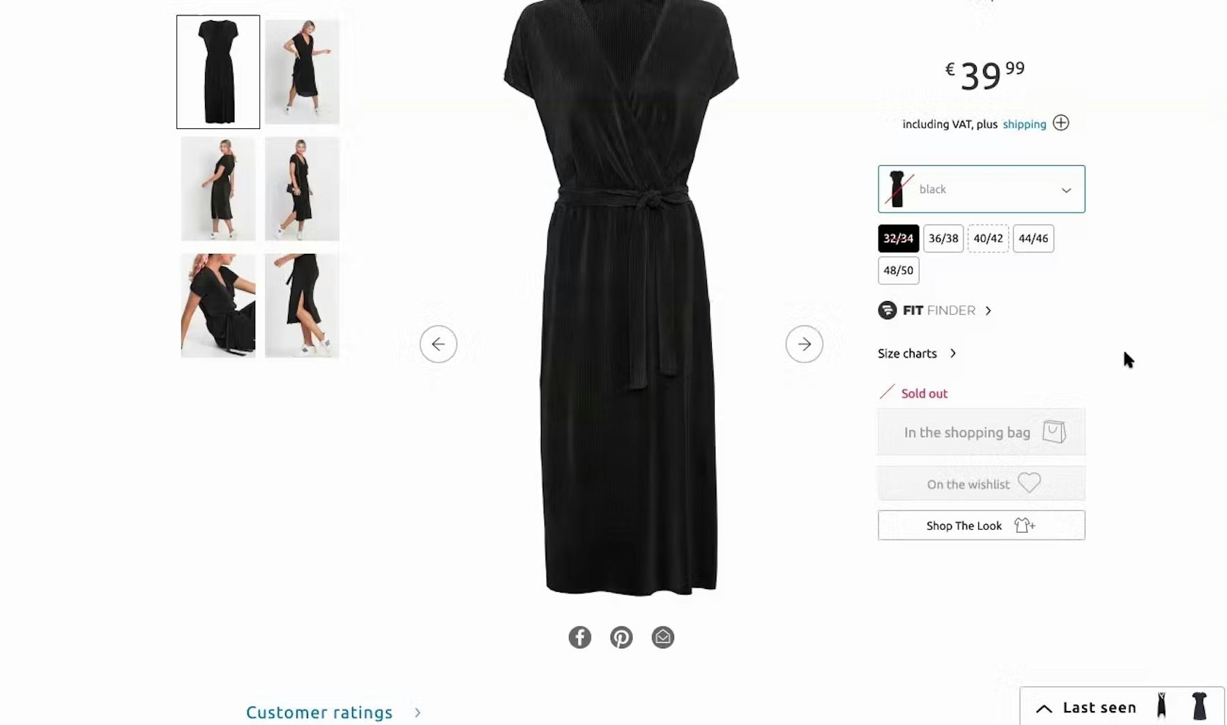
“I think the fact that there is no information now on how to send it back, it’s a problem.” During large-scale testing on European sites, participants such as this one on Zalando (Germany) checked for returns policies and were very hesitant to buy if they couldn’t find them easily.
When shopping for products online, users understand that even seemingly perfect products may not work in reality.
Indeed, a strict return policy can even be a reason for site abandonment, as our quantitative study of 4,384 online shoppers in the US revealed: 12% of e-commerce customers have abandoned orders in the last quarter because they found the return policy unsatisfactory (see our cart abandonment rate page).
Consequently, lacking access to the return policy early on in users’ product search — especially for products such as apparel items, which can have dramatically different sizes depending on where you shop — is a source of anxiety for many users.
“‘Returns info’, that would be something important for me.” This test participant on Boohoo UK was happy to quickly find the “Returns Info” section on the product page. Returns policies on apparel sites are especially important, given the importance of trying on clothing to judge suitability.
Therefore, a link to the return policy, or a brief summary of the general return policy, should be prominently displayed on the product page (as well as in the footer), and the return policy text must be written to be understandable by the average user.
9) Place “Free Shipping” Information In or Near the “Buy” Section (23% Don’t)
On Ulta, “free shipping” information is only promoted in a banner at the top of the product page. During testing, many participants overlooked such notices and instead focused on exploring information near the “Buy” section.
During testing, the now decade-old “banner blindness” issue was once again observed, as some users overlooked “free shipping” information located in sitewide banners either in the page header or at the top of the product page.
As most users will associate any banners with ads, they will consequently ignore the “free shipping” banner, as it occurred for up to up to 27% of the participants during testing.
As a result, some users will conduct extended searches for this information on the product page, while a subset will wrongly conclude that “free shipping” isn’t available at all at a particular site.
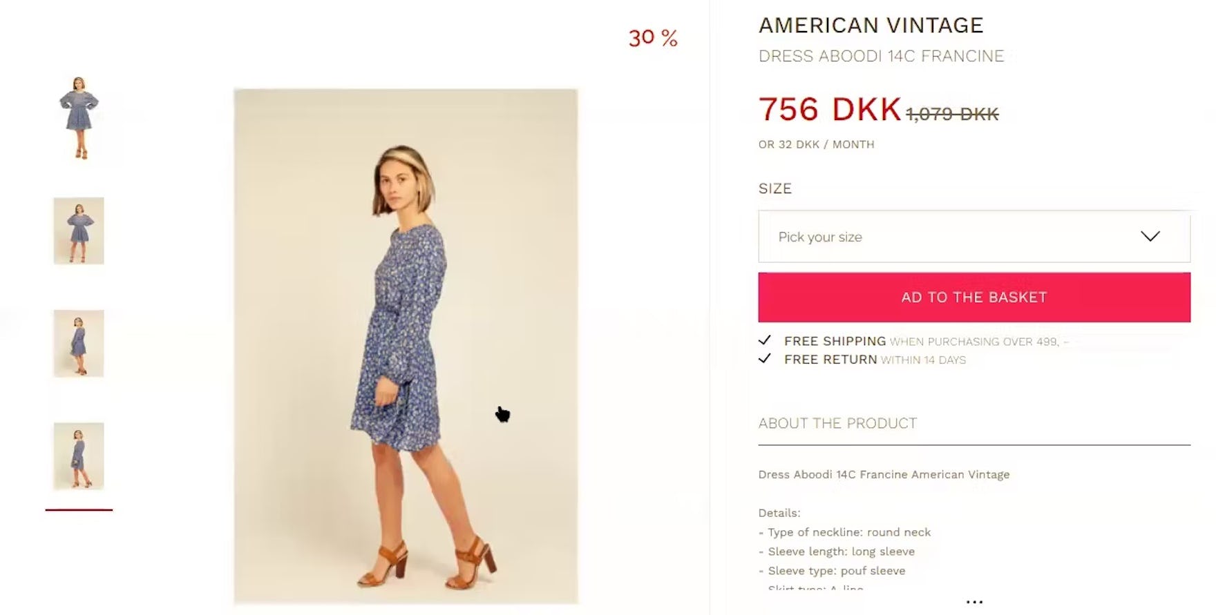
“I also like that they have written this, ‘free shipping’ and ‘free return’. Which I also said before was important for me.” During our large-scale European testing, this test participant quickly spotted the prominent “Free Shipping” information just below the primary button on the product page on the Nordic apparel site Miinto.
Instead, “free shipping” information should be placed near the “Buy” section, where it’s much easier for most users to locate.
This may also help reduce users abandoning their orders due to extra costs being too high, which is the case for 48% of users, as indicated in our cart abandonment rate data.


