Summary: 
Checkboxes allow users to select one, some, or none of items from a list. They can be used standalone, in checkbox lists, or nested checkbox lists.

There are ample options for different kinds of fields when designing digital forms. Each serves a specific purpose, from radio buttons to dropdowns to open text fields. But if you want to offer users the flexibility of selecting one, multiple, or no items from a list, checkboxes are your friend.

What Are Checkboxes?

A checkbox is a UI element that allows users to select between two states: checked and unchecked. When appearing in nested checkbox lists, a checkbox could also display a third, so-called “indeterminate” state, indicating that some but not all children of that checkbox were selected.

Three types of checkboxes: standalone, lists, and nested.

Checkbox List vs. Standalone Checkbox vs. Nested Checkboxes

There are three distinct checkbox applications, and each functions slightly differently.

Standalone Checkbox

This type of checkbox appears by itself. There are no other checkboxes around it, and it is frequently cordoned off in its own visually distinctive container. The checkbox and its label, in this case, demand attention and consideration on their own.

Standalone checkboxes are often used when a user must agree to an app’s terms and conditions. In this case, the checkbox field is typically indicated as required with a text label or red asterisk. The user is unable to move on without selecting their agreement.

Another common application is opting into email or SMS notifications in a checkout flow.

Screenshot of a DoorDash order summary. The summary includes the following details: Subtotal is $27.00, Delivery Fee is reduced from $1.99 to $0.49, and Fees & Estimated Tax is $6.37. The total amount is $33.86. There is an unchecked checkbox option to 'Save $3.19 on this order with a free trial of DashPass.' Below that, a banner indicates 'Saving $1.50 with Promotions.' At the bottom, there is a red 'Continue' button.
A standalone checkbox on the DoorDash app.

Checkbox List

This is the most common application of checkboxes. In a checkbox list, each checkbox functions independently. The selection or deselection of a checkbox does not affect the selection status of others in the list. A checkbox list allows users the unique ability to select one, several, all, or no items from a list.

A checkbox list is useful when you want to allow users to select any number of items from a list, and you do not have reason to believe Select All will be a common selection.

Selecting ingredients in a food-ordering app or parameters in a faceted-search functionality are common applications of a checkbox list.

Screenshot of a pizza topping selection screen from Domino's. The section is titled '4. Toppings' and is divided into two categories: 'Choose Meats' and 'Choose Non-meats'. Under 'Choose Meats', there are checkboxes for Ham, Beef, Salami, Pepperoni, Italian Sausage, Premium Chicken, Bacon, Philly Steak, and Anchovies. Under 'Choose Non-meats', there are checkboxes for Hot Buffalo Sauce, Garlic, Jalapeno Peppers, Onions, Banana Peppers, Diced Tomatoes, Black Olives, Mushrooms, Pineapple, Shredded Provolone Cheese, Cheddar Cheese Blend, Green Peppers, Spinach, Feta Cheese, and Shredded Parmesan Asiago.
This example from the Domino’s website features checkboxes to select pizza toppings.

Nested Checkbox Lists

Nested checkboxes use a parent checkbox followed by a sublist of indented child checkboxes. This layout affords additional functionality beyond the previous applications because:

  • Users may select or deselect the parent checkbox, which would also select or deselect all the child checkboxes.
  • Users may select any of the child checkboxes independently. When some but not all the child checkboxes are selected, the parent checkbox displays an “indeterminate” state, usually signified with a hyphen.
Comparison of nested checkbox lists demonstrating different selection states. The title is 'Nested Checkbox Lists'.  There are three columns labeled 'All Selected', 'None Selected', and 'Some Selected'.  Under 'All Selected', there is a nested list with the parent checkbox labeled 'Check in all' shown as a solid green square, indicating all items are selected. The child checkboxes for 'Helen Sharp', 'Kelly Gao', 'Raquel Kraft', and 'Sally Wiggins' are all checked.  Under 'None Selected', the parent checkbox 'Check in all' is empty, indicating none of the items are selected. The child checkboxes for 'Helen Sharp', 'Kelly Gao', 'Raquel Kraft', and 'Sally Wiggins' are all unchecked.  Under 'Some Selected', the parent checkbox 'Check in all' is shown as a green dash, indicating some but not all items are selected. The child checkboxes for 'Helen Sharp' and 'Kelly Gao' are checked, while 'Raquel Kraft' and 'Sally Wiggins' are unchecked.
The nested checkbox list has 3 possible states.

Nested checkboxes are useful when you expect many users to select all the checkboxes in a list.

For example, in an airline check-in flow, the app might ask the user to “Select which passengers you’d like to check in.” In this case, a parent checkbox might be labeled “All passengers,” with child checkboxes for each individual passenger. The most common use case would be a person checking in their entire party, so using nested checkboxes aids the user experience.

Screenshot of a mockup for an airline check-in interface titled 'Trip to Buenos Aires'. The top part of the interface shows an image of a city skyline with a note 'Updated a minute ago'. Below the image, there is a date badge labeled 'OCT 20'.  The section below the date reads 'Check-in Flight' with the instruction 'Please select which passengers you’d like to check in.' There is a checkbox labeled 'Select all passengers' which is checked. The following passenger names are listed with checked checkboxes:  Helen Sharp Kelly Gao Raquel Kraft Sally Wiggins At the bottom, there is a 'Next' button.
An airline app like this is one possible use case for nested checkboxes.

Checkboxes vs. Alternative Input Fields

In digital-form design, several elements allow for selecting particular items from a list. It is important to know which one is right for your needs.

Checkboxes differ from, but are often confused with, radio buttons. Amongst a list of radio buttons, only one button may be selected at a time. In order words, the selection of a nonselected radio button will, in turn, deselect any other previously selected option.

Animation showing a group of checkboxes and radio buttons being selected and unselected
This animation demonstrates that checkboxes all function independently, and the user may select some, all, or none of them. Radio buttons are mutually exclusive, and one and only one must always be selected.


Example Uses

Available Items

Available selections

Selection functionality

Checkbox List

Selecting which pizza toppings you’d like

Multiple

0 – all

Independent of each other

Standalone Checkbox

Agreeing to a privacy policy

2 (selected/unselected)

1

Mutually exclusive

Nested Checkboxes

Selecting passengers to check into a flight

Multiple

0 – all

Parent selection is dependent on child selections

Radio Buttons

Selecting which pizza crust type you’d like

Few options

1

Mutually exclusive

Dropdowns

Selecting your title (e.g., Mr., Mrs., Ms., Miss, Mx)

Multiple

1

Mutually exclusive

Toggle Switches

Turning dark mode on and off

2 (on / off)

1

Mutually exclusive

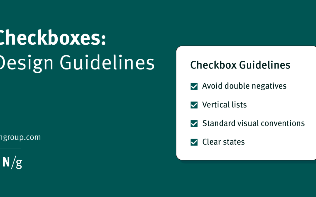
Checkbox-Usability Guidelines

Use Standard Visual Conventions

Users expect checkboxes to look like checkboxes: squares (with or without rounded corners), with a checkmark to communicate selection. Designers should adhere to these conventions.

Never use circles as checkboxes. These are easily confused with radio buttons and should be avoided.

Comparison of checkbox designs demonstrating the principle of using standard visual conventions. The title is 'Use Standard Visual Conventions'.  On the left side, there is a screenshot of a checkout screen from a mobile app, showing a delivery instruction section with a round checkbox labeled 'Leave at door' which is checked. Above this checkbox, there is a pink circle with an 'X' indicating this option is incorrect. Below the image, there is a note: 'Dominos uses round checkboxes, making them indistinguishable from other radio buttons in the app.'  On the right side, there is a screenshot of a list of makeup brands with square checkboxes next to each name. The brands listed are e.l.f., NYX PROFESSIONAL MAKEUP, Milani, URBAN DECAY, MAYBELLINE, wet n wild, and Mario Badescu. There is also a link labeled 'See more' at the bottom. Above this list, there is a green circle with a checkmark indicating this option is correct. Below the image, there is a note: 'Amazon uses traditional square checkboxes.'
Use standard square or rounded square checkboxes to avoid confusion with radio buttons or other elements.

Make the Label Selectable

Don’t force users to click or tap on a too-small box to make their selection. Include a perimeter around the checkbox and make the label clickable to allow for adequate touch-target size (at least 1 cm x 1 cm).

Screenshot of a food ordering app showing the customization options for a Custom Medium 2-Topping pizza. The time displayed is 1:21 PM. The section is titled 'Add Toppings' with a note to 'Choose up to 2'. There are checkboxes next to the following topping options: Ham, Beef, Salami, Pepperoni, Italian Sausage, Premium Chicken, Bacon, Philly Steak, Anchovies, Hot Buffalo Sauce, and Garlic. At the bottom, there is a black button labeled 'Add 1 to cart • $15.47'.
Uber Eats uses horizontal lines to visually indicate that the labels and the checkboxes are both selectable.

Use Positively Worded Labels

Ensure that all your label statements are worded positively. Negatively worded statements force users to contemplate double negatives, leading to errors.

In the bad example below, when the item Do not send me marketing updates is unchecked, it essentially translates to Don’t do not send me marketing updates — in other words, send me marketing updates.

Comparison of checkbox options demonstrating the principle of avoiding double negatives. The title is 'Avoid Double Negatives'.  On the left side, there is a checkbox labeled 'Do not send me marketing updates' with a checkmark next to it. Above this checkbox, there is a pink circle with an 'X' indicating this option is incorrect.  On the right side, there is a checkbox labeled 'Send me marketing updates' with a checkmark next to it. Above this checkbox, there is a green circle with a checkmark indicating this option is correct.
Double negatives are harder to understand.

Guidelines for Checkbox Lists and Nested Checkboxes

Present Items in a Logical Order

Present your list of checkbox items in a logical order to aid scannability and comprehension. Consider using subheads to break up a long list of checkboxes if possible.

Screenshot of a size selection menu from a shopping app. The section is titled 'Size' with a close button in the top right corner. There are checkboxes next to the following size options: Newborn, 0-3 Months, 3-6 Months, 6-9 Months, 12-18 Months, 18-24 Months, and One Size Fits Most.
Target places filter checkboxes in a logical order by age.

Instruct Users to Select All that Apply

While many people understand that checkboxes allow for the selection of multiple items, confusion persists. Consider your use case and target audience, and whether including the phrase Select all that apply would be valuable.

Screenshot of a survey screen from the McDonald's app. The top bar has a 'Cancel' button on the left and the text 'Tell us more!' in the center. The first question asks, 'Why did you use the McDonald's app today?' with a note to 'select all that apply'. The options with checkboxes are: Order for delivery, Earn points with MyMcDonald’s Rewards, Order ahead (before arriving at the restaurant), Use a deal for a discount, Redeem points for free items with MyMcDonald’s Rewards, and Other (please specify).  The second question asks, 'How easy or difficult was it to use the McDonald’s app today?' with a note to 'select one'. The options with radio buttons are: Very easy, Somewhat easy, Neither easy nor difficult, Somewhat difficult, and Very difficult.
This McDonald’s survey differentiates between checkboxes and radio buttons with the inclusion of help text that reads Select all that apply or Select one.

Clearly State Any Minimum- or Maximum-Selection Requirements

Do users need to select at least one item from the list? Or to select no more than 3?

Clearly state any requirements in the instructions and provide real-time visual feedback when the requirements have been satisfied or violated.

Screenshot of a food ordering app showing the customization options for an order. The time displayed is 1:06 PM. At the top, there are radio buttons to select either Sushi Rice or Brown Rice, with Brown Rice selected.  Below that, there is a section titled 'Frequently Bought Together' with a note that it is optional and to 'Select up to 4'. The options with checkboxes are:  Homemade Miso Soup (+$5.99) Seaweed Salad (+$5.99) Asian Sesame Salad (+$5.99) Kani Salad (+$5.99) Bottled Water (+$1.95) Hawaiian Sun (+$2.75) Diet Coke (+$2.75) At the bottom, there is a section titled 'Crunch Choice' with a note that it is optional and to 'Select up to 6'. Below that, there is a red button labeled 'Add to Order • $15.99'.
This list of additional items to purchase from DoorDash advises the user to Select up to 4.

List Items Vertically

Some designers display checkbox items horizontally to save vertical space on the page. This approach decreases scannability and sometimes makes it difficult to align the labels with the appropriate checkbox. Display your list vertically.

Comparison of checkbox options demonstrating the principle of listing checkboxes vertically. The title is 'List Checkboxes Vertically'.  On the left side, there are two checkboxes labeled 'Apples' and 'Pears' displayed horizontally, both checked. Above this horizontal list, there is a pink circle with an 'X' indicating this layout is incorrect.  On the right side, there are four checkboxes labeled 'Apples', 'Pears', 'Bananas', and 'Mango' displayed vertically, all checked. Above this vertical list, there is a green circle with a checkmark indicating this layout is correct.
Vertical checkbox lists are easier to scan than horizontal ones. 

Guidelines for Standalone Checkboxes

Default to Unselected for Promotional or Legal Checkboxes

When presenting a checkbox for users to opt into various promotions, such as receiving marketing emails, many designers preset the default state of the checkbox to selected, forcing the user to take the action of unselecting the box to opt-out.

This is a deceptive pattern and should be avoided.

Similarly, when displaying checkboxes indicating agreement with legal statements such as terms and conditions, always set the checkbox’s default state to unselected.

Ensure Both Possible States Are Intuitive, Opposites, and Unambiguous

Offering users the ability to select a checkbox requires a crystal-clear understanding of the selected and unselected states. If these states are not intuitive to the user, consider using alternative UI elements such as radio buttons or dropdowns.

Comparison of checkbox and radio button options demonstrating the principle of ensuring both states are clear. The title is 'Ensure Both States Are Clear'.  On the left side, there is a single checkbox labeled 'Print to PDF' which is unchecked. Above this checkbox, there is a pink circle with an 'X' indicating this option is incorrect.  On the right side, there are two radio buttons labeled 'Send to printer' and 'Print to PDF'. The 'Send to printer' radio button is selected. Above this set of options, there is a green circle with a checkmark indicating this layout is correct.
The checkbox on the right has an ambiguous unselected state: what will happen to the document if not printed to PDF? Nothing? Will it be sent to the printer?


Source link

Share This